Skip to board
Tilt.
Everything, as it runs. Hover a tile to play it, press space to look closer.
Start from
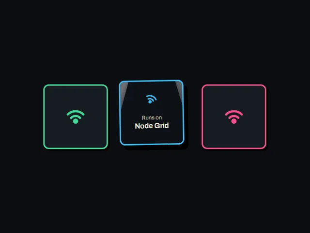
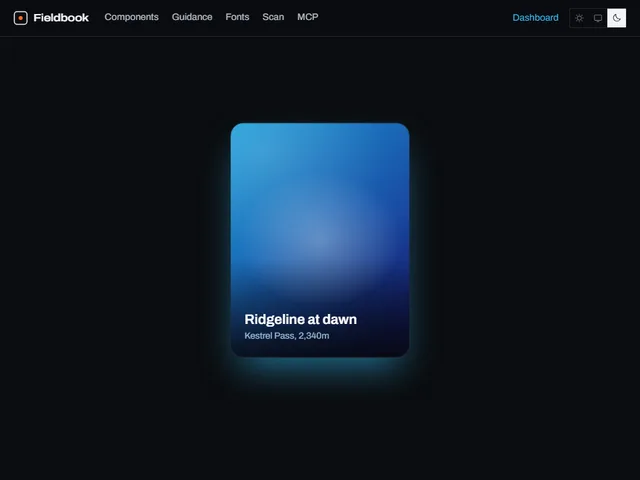
Compare these components
Choose by behavior and layout, then check the available frameworks and access requirements on each component page.
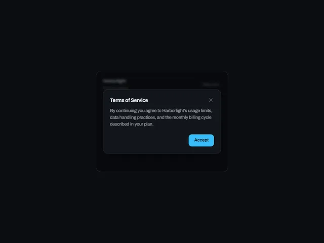
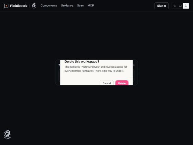
- Consequence confirm dialog
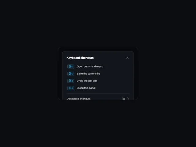
A confirmation dialog that tilts into view from a chosen edge and blocks the page until the visitor explicitly cancels or continues.
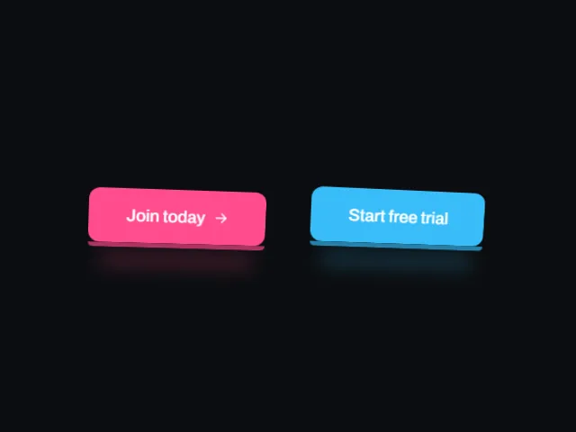
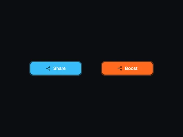
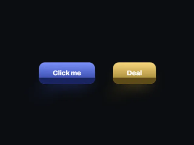
- Outset ring tilt button
A badge-style button with a thick ring floating outside its edge that grows, tips a couple of degrees and drops a hard shadow on hover.
- Perspective reveal dialog
A general purpose dialog whose panel tilts in from a chosen edge in 3D, then flattens into place, for showing arbitrary content over a dimmed page.
Open the full index
Tags
3D (7)Administration (6)Ambient (18)Analytics (8)Animated (21)Area (9)Arrow (10)Avatar (7)Backdrop (9)Background (25)Badge (9)Bar (9)Button (158)Calendar (8)Call to action (6)Canvas (41)Card (15)Chart (32)Chip (11)Collapse (6)Confirm (13)Controlled state (10)Count (6)Counter (8)Call to action (12)Cursor (11)Customer (6)Depth (12)Diagonal (6)Dialog (11)Dot (7)Drag (8)Drawer (7)Drift (10)Expand (10)Fill (15)Flood (8)Focus (8)Follow (6)Form (24)Frame (9)Gallery (9)Glow (15)Gradient (17)Grid (13)Halo (7)Headline (6)Hero section (6)Highlight (6)Hint (6)Hover (89)Icon (44)Icon button (8)Input (9)Interactive (25)Invert (14)Label (9)Label swap (6)Layout (8)Lift (10)Light (10)Line (7)Loading (10)Loop (14)Menu (10)Metric (8)Modal (8)Monthly (6)Navigation (9)Noise (9)Orbit (7)Outline (23)Overlay (7)Page (10)Panel (15)Parallax (8)Particle (12)Perspective (9)Pill (35)Pointer (32)Popover (7)Press (28)Progress (10)Pulse (7)Reveal (30)Ring (12)Rotate (6)Row (7)Scale (9)Scroll (12)Send (7)Settings (7)Shadow (13)Share (15)Slide (10)Spring (24)Stack (7)Stagger (13)Status (8)SVG (30)Sweep (15)Switch (7)Tactile (6)Text (10)Tile (12)Tilt (10)Toggle (32)Toolbar (11)Tooltip (18)Trail (7)Trend (7)Typography (8)Underline (6)Wave (9)Wipe (6)Workflow (9)Workspace (13)