Skip to board
Send.
Everything, as it runs. Hover a tile to play it, press space to look closer.
Start from
Compare these components
Choose by behavior and layout, then check the available frameworks and access requirements on each component page.
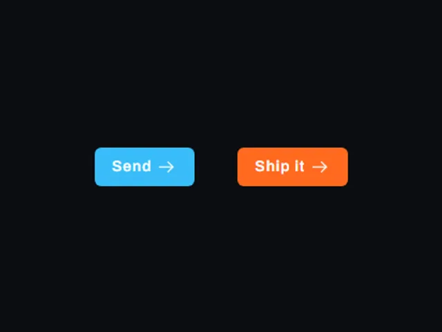
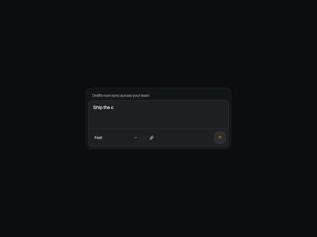
- Departing send button
A send button that flies its glyph off the right edge and empties its label on hover, revealing a second line over a spreading accent wash.
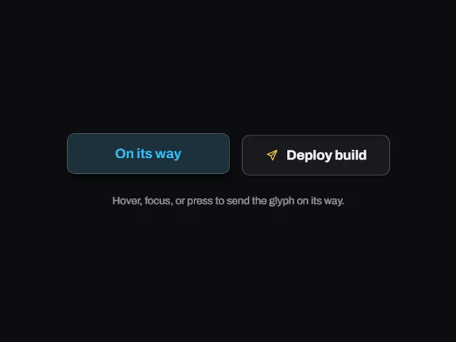
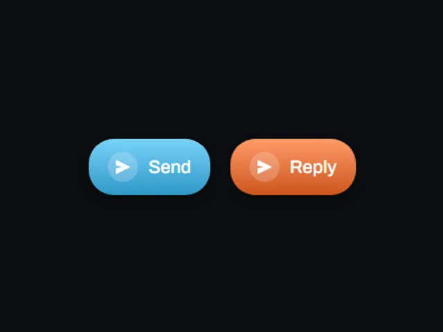
- Icon badge send
A rounded send button whose glyph sits in a translucent circular badge that brightens and turns while the whole button lifts on hover and settles on press.
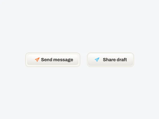
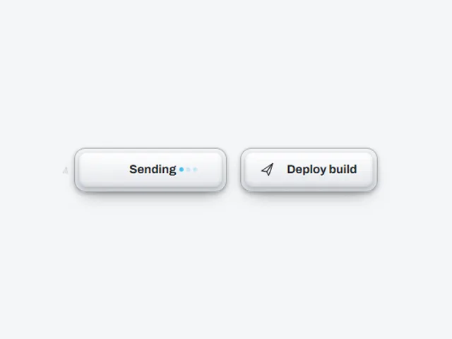
- Breathing Inset Button
A pale moulded button whose inner panel pulls away from the rim on hover while the send glyph slides a short distance toward the label.
Open the full index
Tags
3D (7)Administration (6)Ambient (18)Analytics (8)Animated (21)Area (9)Arrow (10)Avatar (7)Backdrop (9)Background (25)Badge (9)Bar (9)Button (158)Calendar (8)Call to action (6)Canvas (41)Card (15)Chart (32)Chip (11)Collapse (6)Confirm (13)Controlled state (10)Count (6)Counter (8)Call to action (12)Cursor (11)Customer (6)Depth (12)Diagonal (6)Dialog (11)Dot (7)Drag (8)Drawer (7)Drift (10)Expand (10)Fill (15)Flood (8)Focus (8)Follow (6)Form (24)Frame (9)Gallery (9)Glow (15)Gradient (17)Grid (13)Halo (7)Headline (6)Hero section (6)Highlight (6)Hint (6)Hover (89)Icon (44)Icon button (8)Input (9)Interactive (25)Invert (14)Label (9)Label swap (6)Layout (8)Lift (10)Light (10)Line (7)Loading (10)Loop (14)Menu (10)Metric (8)Modal (8)Monthly (6)Navigation (9)Noise (9)Orbit (7)Outline (23)Overlay (7)Page (10)Panel (15)Parallax (8)Particle (12)Perspective (9)Pill (35)Pointer (32)Popover (7)Press (28)Progress (10)Pulse (7)Reveal (30)Ring (12)Rotate (6)Row (7)Scale (9)Scroll (12)Send (7)Settings (7)Shadow (13)Share (15)Slide (10)Spring (24)Stack (7)Stagger (13)Status (8)SVG (30)Sweep (15)Switch (7)Tactile (6)Text (10)Tile (12)Tilt (10)Toggle (32)Toolbar (11)Tooltip (18)Trail (7)Trend (7)Typography (8)Underline (6)Wave (9)Wipe (6)Workflow (9)Workspace (13)