Skip to board
Navigation.
Everything, as it runs. Hover a tile to play it, press space to look closer.
Start from
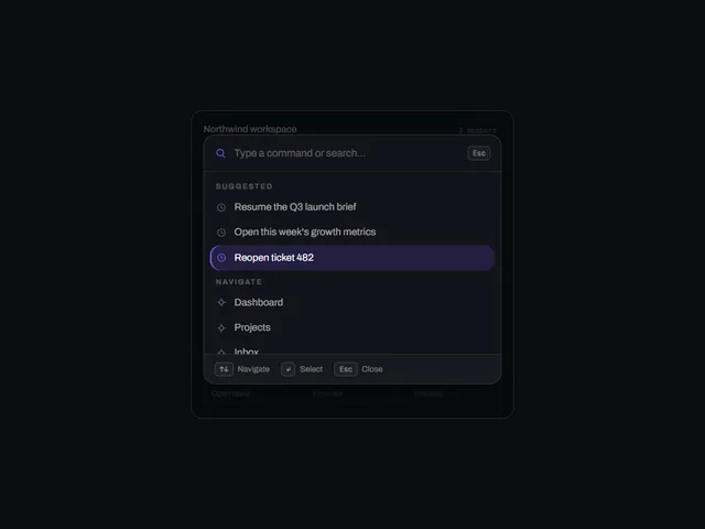
Compare these components
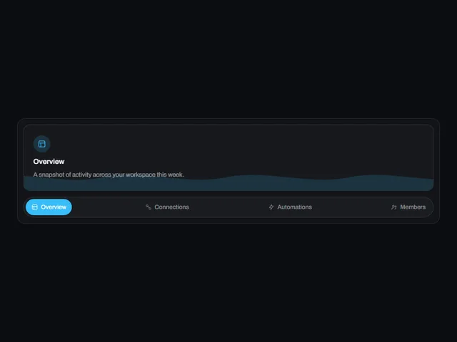
Choose by behavior and layout, then check the available frameworks and access requirements on each component page.
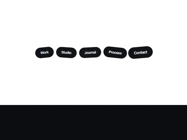
- Bubble burst menu
A floating logo pill and toggle that expand into a full screen overlay of oversized pill links, each bursting into place with a springy stagger.
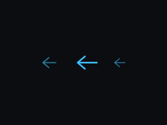
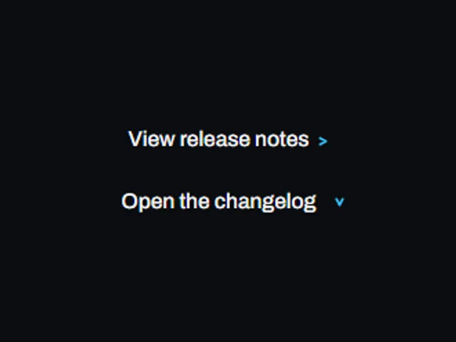
- Caret tail link
A quiet text link with a small angle bracket riding just past its last letter, which slides outward and gains an underline on hover.
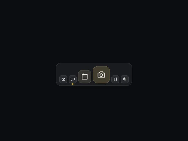
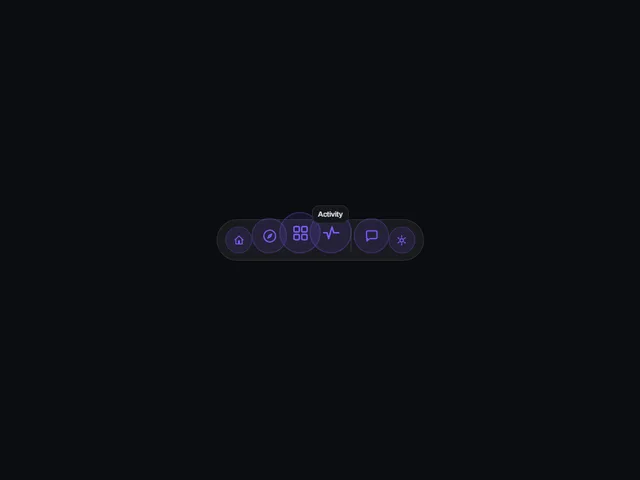
- Grouped magnify dock
A bottom dock of round icon buttons split into two clusters that grow the closer the pointer gets to each one.
Open the full index
Tags
3D (7)Administration (6)Ambient (18)Analytics (8)Animated (21)Area (9)Arrow (10)Avatar (7)Backdrop (9)Background (25)Badge (9)Bar (9)Button (158)Calendar (8)Call to action (6)Canvas (41)Card (15)Chart (32)Chip (11)Collapse (6)Confirm (13)Controlled state (10)Count (6)Counter (8)Call to action (12)Cursor (11)Customer (6)Depth (12)Diagonal (6)Dialog (11)Dot (7)Drag (8)Drawer (7)Drift (10)Expand (10)Fill (15)Flood (8)Focus (8)Follow (6)Form (24)Frame (9)Gallery (9)Glow (15)Gradient (17)Grid (13)Halo (7)Headline (6)Hero section (6)Highlight (6)Hint (6)Hover (89)Icon (44)Icon button (8)Input (9)Interactive (25)Invert (14)Label (9)Label swap (6)Layout (8)Lift (10)Light (10)Line (7)Loading (10)Loop (14)Menu (10)Metric (8)Modal (8)Monthly (6)Navigation (9)Noise (9)Orbit (7)Outline (23)Overlay (7)Page (10)Panel (15)Parallax (8)Particle (12)Perspective (9)Pill (35)Pointer (32)Popover (7)Press (28)Progress (10)Pulse (7)Reveal (30)Ring (12)Rotate (6)Row (7)Scale (9)Scroll (12)Send (7)Settings (7)Shadow (13)Share (15)Slide (10)Spring (24)Stack (7)Stagger (13)Status (8)SVG (30)Sweep (15)Switch (7)Tactile (6)Text (10)Tile (12)Tilt (10)Toggle (32)Toolbar (11)Tooltip (18)Trail (7)Trend (7)Typography (8)Underline (6)Wave (9)Wipe (6)Workflow (9)Workspace (13)