Skip to board
Press.
Everything, as it runs. Hover a tile to play it, press space to look closer.
Start from
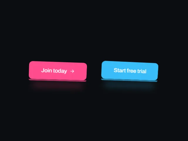
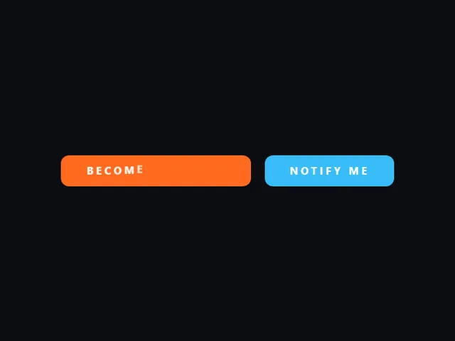
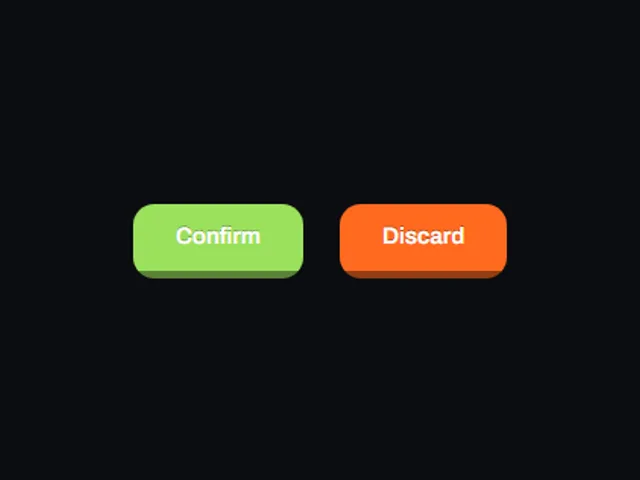
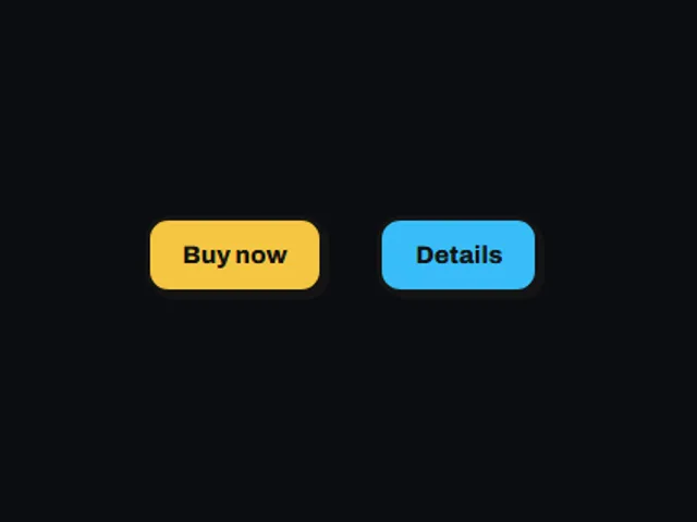

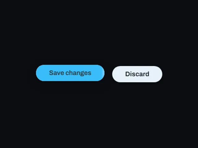
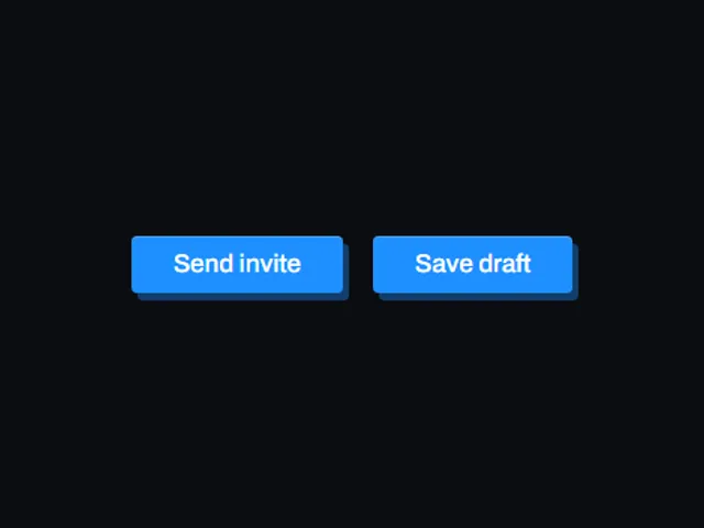
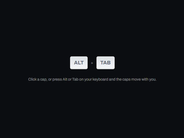
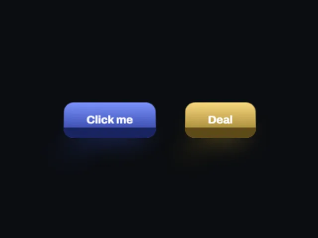
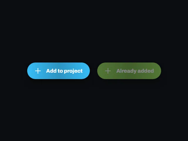

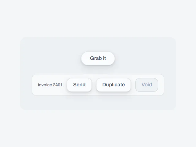
Compare these components
Choose by behavior and layout, then check the available frameworks and access requirements on each component page.
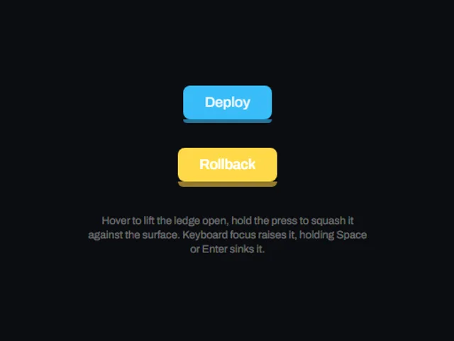
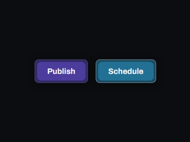
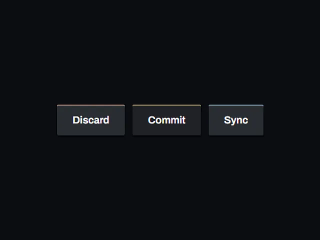
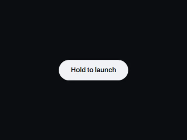
- Bevel press pill
A dark bevelled pill with a recessed round chip on its end that sinks into the surface when pressed.
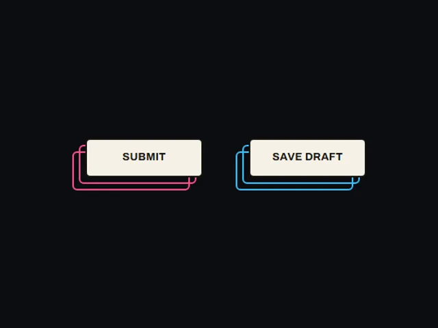
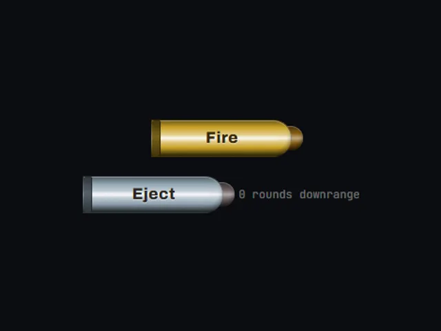
- Cartridge fire button
A novelty button shaped like a brass shell case, with a projectile tucked behind its nose that shoots out and reloads when pressed.
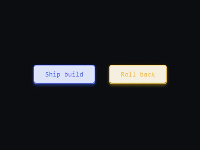
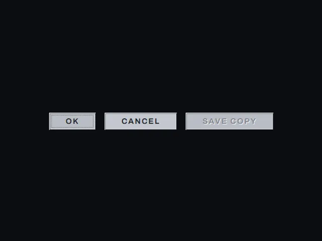
- Dialog bevel button
A small grey system button built from two nested hard bevels and a dotted inner focus mark, whose bevel lines swap on press so it reads as pushed in.
Open the full index
- Bevel press pill
- Cartridge fire button
- Dialog bevel button
- Edge Collapse Button
- Elevated chip button
- Elevation ladder fill button
- Grounded download pill
- Growing ledge button
- Hard edge key button
- Hard Shadow Button
- Hop lift button
- Inset plate button
- Letter cascade button
- Lift and Sink Button
- Live keycap
- Molded bevel button
- Offset outline stack
- Particle spray
- Press block button
- Press down sweep button
- Pressed ledge button
- Ripple tap button
- Sheen upload button
- Snap back icon button
- Swelling pill add button
- Three layer push button
- Tilted deck button
- Tilted plinth call to action
Tags
3D (7)Administration (6)Ambient (18)Analytics (8)Animated (21)Area (9)Arrow (10)Avatar (7)Backdrop (9)Background (25)Badge (9)Bar (9)Button (158)Calendar (8)Call to action (6)Canvas (41)Card (15)Chart (32)Chip (11)Collapse (6)Confirm (13)Controlled state (10)Count (6)Counter (8)Call to action (12)Cursor (11)Customer (6)Depth (12)Diagonal (6)Dialog (11)Dot (7)Drag (8)Drawer (7)Drift (10)Expand (10)Fill (15)Flood (8)Focus (8)Follow (6)Form (24)Frame (9)Gallery (9)Glow (15)Gradient (17)Grid (13)Halo (7)Headline (6)Hero section (6)Highlight (6)Hint (6)Hover (89)Icon (44)Icon button (8)Input (9)Interactive (25)Invert (14)Label (9)Label swap (6)Layout (8)Lift (10)Light (10)Line (7)Loading (10)Loop (14)Menu (10)Metric (8)Modal (8)Monthly (6)Navigation (9)Noise (9)Orbit (7)Outline (23)Overlay (7)Page (10)Panel (15)Parallax (8)Particle (12)Perspective (9)Pill (35)Pointer (32)Popover (7)Press (28)Progress (10)Pulse (7)Reveal (30)Ring (12)Rotate (6)Row (7)Scale (9)Scroll (12)Send (7)Settings (7)Shadow (13)Share (15)Slide (10)Spring (24)Stack (7)Stagger (13)Status (8)SVG (30)Sweep (15)Switch (7)Tactile (6)Text (10)Tile (12)Tilt (10)Toggle (32)Toolbar (11)Tooltip (18)Trail (7)Trend (7)Typography (8)Underline (6)Wave (9)Wipe (6)Workflow (9)Workspace (13)