Components
Typography
Type systems, headings and prose treatments.
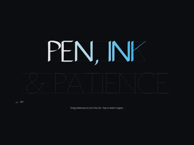
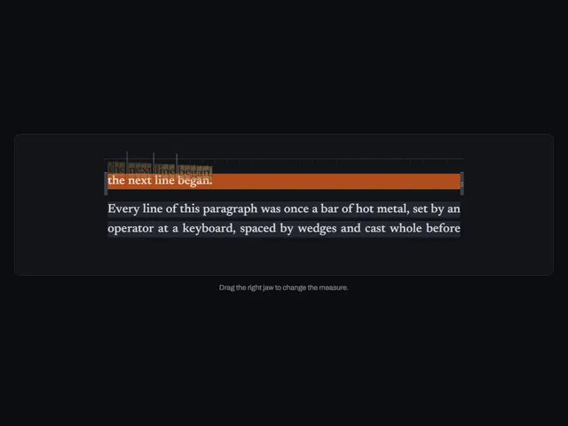
Compare these components
Choose by behavior and layout, then check the available frameworks and access requirements on each component page.
GuidanceOpen the full index
Tags
3D (7)Administration (6)Ambient (18)Analytics (8)Animated (21)Area (9)Arrow (10)Authentication (7)Avatar (7)Backdrop (9)Background (25)Badge (8)Bar (9)Button (158)Calendar (8)Call to action (6)Canvas (41)Card (19)Chart (32)Chip (11)Collapse (6)Confirm (13)Controlled state (10)Count (6)Counter (8)Call to action (12)Cursor (11)Customer (7)Depth (12)Diagonal (6)Dialog (11)Dot (7)Drag (8)Drawer (7)Drift (10)Expand (10)Fill (15)Flood (8)Focus (8)Follow (6)Form (23)Frame (8)Gallery (9)Glow (15)Gradient (17)Grid (13)Halo (7)Highlight (6)Hint (6)Hover (89)Icon (44)Icon button (8)Input (9)Interactive (25)Invert (14)Label (9)Label swap (6)Layout (8)Lift (10)Light (10)Line (7)Loading (10)Loop (14)Menu (10)Metric (8)Modal (8)Monthly (6)Navigation (9)Noise (9)Orbit (7)Outline (23)Overlay (7)Page (8)Panel (15)Parallax (8)Particle (12)Perspective (9)Pill (35)Pointer (26)Popover (7)Press (28)Progress (9)Pulse (7)Reveal (30)Ring (12)Rotate (6)Row (7)Scale (9)Scroll (12)Send (7)Settings (7)Shadow (13)Share (15)Slide (10)Spring (23)Stack (7)Stagger (13)Status (8)SVG (29)Sweep (15)Switch (7)Tactile (6)Text (10)Tile (12)Tilt (10)Toggle (32)Toolbar (11)Tooltip (18)Trail (7)Trend (7)Underline (6)Wave (9)Wipe (6)Workflow (10)Workspace (13)