Skip to board
Label swap.
Everything, as it runs. Hover a tile to play it, press space to look closer.
Start from
Compare these components
Choose by behavior and layout, then check the available frameworks and access requirements on each component page.
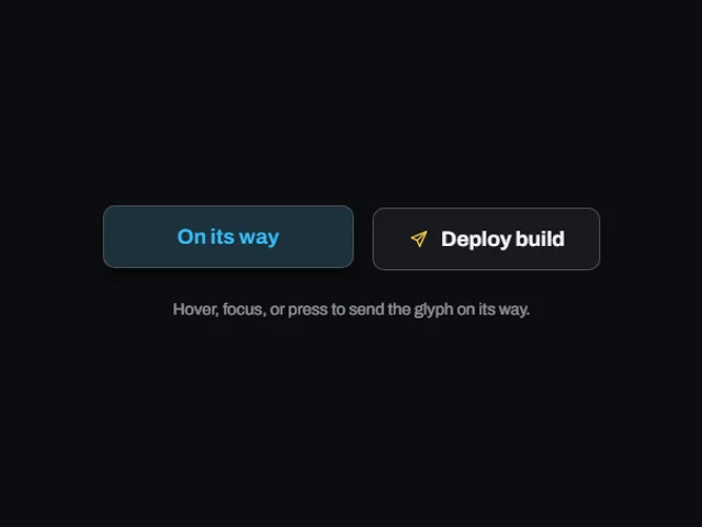
- Departing send button
A send button that flies its glyph off the right edge and empties its label on hover, revealing a second line over a spreading accent wash.
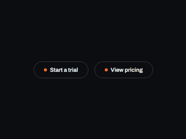
- Dot flood button
An outlined pill with a small dot beside its label; hovering grows the dot until it floods the whole button and the label swaps to its inverted twin.
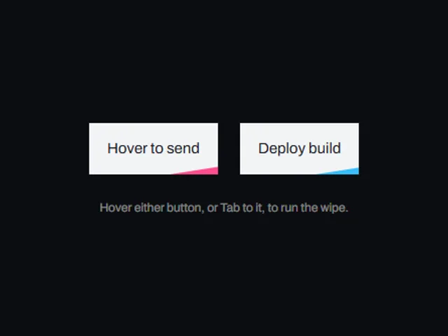
- Rolling Label Button
A compact glowing pill that rolls its caption up out of view and brings a second line in from below on hover.
Open the full index
Tags
3D (7)Administration (6)Ambient (18)Analytics (8)Animated (21)Area (9)Arrow (10)Avatar (7)Backdrop (9)Background (25)Badge (9)Bar (9)Button (158)Calendar (8)Call to action (6)Canvas (41)Card (15)Chart (32)Chip (11)Collapse (6)Confirm (13)Controlled state (10)Count (6)Counter (8)Call to action (12)Cursor (11)Customer (6)Depth (12)Diagonal (6)Dialog (11)Dot (7)Drag (8)Drawer (7)Drift (10)Expand (10)Fill (15)Flood (8)Focus (8)Follow (6)Form (24)Frame (9)Gallery (9)Glow (15)Gradient (17)Grid (13)Halo (7)Headline (6)Hero section (6)Highlight (6)Hint (6)Hover (89)Icon (44)Icon button (8)Input (9)Interactive (25)Invert (14)Label (9)Label swap (6)Layout (8)Lift (10)Light (10)Line (7)Loading (10)Loop (14)Menu (10)Metric (8)Modal (8)Monthly (6)Navigation (9)Noise (9)Orbit (7)Outline (23)Overlay (7)Page (10)Panel (15)Parallax (8)Particle (12)Perspective (9)Pill (35)Pointer (32)Popover (7)Press (28)Progress (10)Pulse (7)Reveal (30)Ring (12)Rotate (6)Row (7)Scale (9)Scroll (12)Send (7)Settings (7)Shadow (13)Share (15)Slide (10)Spring (24)Stack (7)Stagger (13)Status (8)SVG (30)Sweep (15)Switch (7)Tactile (6)Text (10)Tile (12)Tilt (10)Toggle (32)Toolbar (11)Tooltip (18)Trail (7)Trend (7)Typography (8)Underline (6)Wave (9)Wipe (6)Workflow (9)Workspace (13)