Components
Letter
Explore live previews, find your fit, and bring open components into your project with source code included.
10 of 10
Compare these components
Choose by behavior and layout, then check the available frameworks and access requirements on each component page.
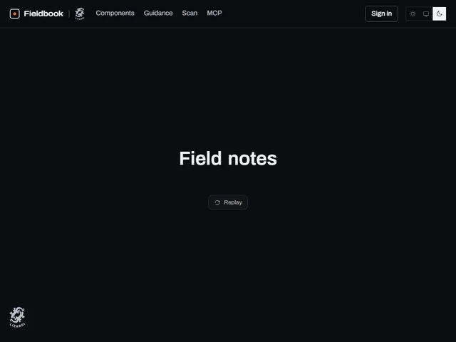
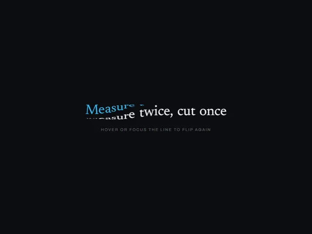
- Cube flip letters
Hovering a line turns every letter a quarter turn in 3D, one after another from a chosen origin, revealing a second face that carries the same glyph in the accent.
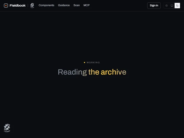
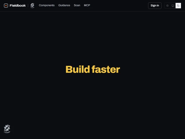
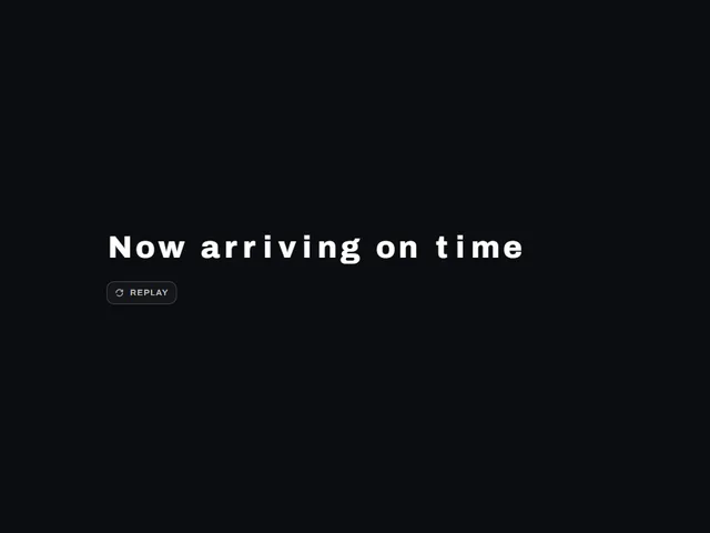
- Flip panel headline reveal
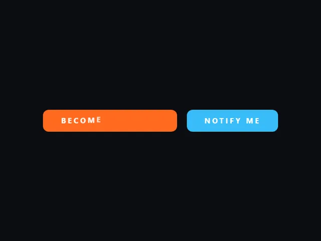
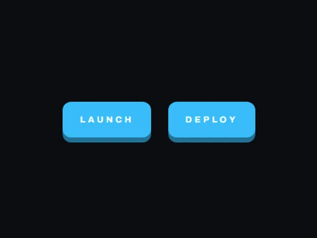
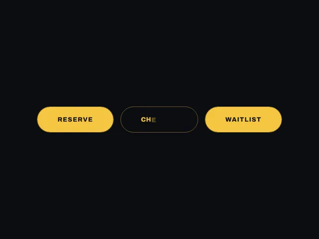
- Letter cascade button
A wide solid button whose centred label drops away and is rebuilt one letter at a time as each character falls into place from above.
Open the full index
Tags
3D (16)Accordion (9)Action (9)Add (7)Administration (12)Agent (12)Alert (8)Ambient (39)Analytics (13)Animated (82)Arc (7)Area (12)Arrow (33)Authorization (11)Authentication (12)Avatar (13)Backdrop (18)Background (54)Badge (22)Band (8)Banner (9)Bar (22)Beam (11)Bevel (12)Billing (10)Blob (7)Bloom (10)Blur (15)Booking (9)Border (16)Bounce (6)Burst (7)Button (401)Calendar (32)Call to action (11)Canvas (89)Capsule (12)Caption (8)Card (42)Carousel (11)Chart (59)Checkbox (13)Checklist (7)Chevron (10)Chip (26)Circle (9)Click (7)Clip (9)Code (6)Collapse (11)Collapsible (6)Column (7)Commercial (10)Compact (8)Comparison (8)Confirm (24)Confirmation (7)Controlled state (18)Corner (13)Count (7)Counter (18)Crosshair (6)Call to action (28)Cursor (26)Curtain (7)Customer (13)Cycle (6)Dark (15)Dashboard (9)Data (13)Date picker (16)Date range (13)Delete (8)Depth (32)Destructive (9)Diagonal (13)Dialog (17)Direction (6)Disclosure (8)Dismiss (6)Donut chart (7)Dot (17)Download (10)Drag (21)Drawer (10)Drift (17)Dropdown (18)Edge (7)Elastic (8)Elevation (6)Entrance (14)Expand (23)Fade (9)Fan (6)Feedback (12)Field (8)Fill (46)Filter (14)Finance (10)Flat (6)Flip (10)Flood (14)Focus (19)Focus trap (6)Folder (7)Follow (11)Form (48)Form control (12)Frame (20)Gallery (15)Gesture (6)Ghost (7)Glitch (9)Glow (39)Glyph (9)Gradient (38)Grain (10)Grid (35)Group (8)Hairline (8)Halo (15)Hard shadow (6)Heading (8)Headline (19)Hero section (11)Highlight (22)Hint (12)Hold (6)Hover (251)Hover card (10)Icon (125)Icon button (24)Indicator (9)Input (20)Inset (11)Interactive (50)Invert (26)Key (11)Keyboard (20)Keyboard navigation (6)Keycap (10)Label (21)Label swap (9)Layered (9)Layout (18)Ledge (6)Legend (9)Letter (10)Lift (19)Light (22)Line (19)Link (11)Link preview (7)Liquid (7)List (13)Loader (9)Loading (27)Login (10)Loop (42)Marker (9)Marquee (8)Mask (9)Menu (23)Metal (10)Metric (15)Minimal (10)Modal (19)Monospace (12)Monthly (12)Morph (14)Moulded (6)Navigation (21)Nested (7)Noise (16)Notification (7)Number (11)Offset (7)Orbit (13)Outline (63)Overflow (7)Overlay (24)Page (19)Panel (37)Parallax (15)Particle (18)Pattern (9)Perspective (20)Photo (6)Pie chart (7)Pill (83)Plate (9)Playful (7)Pointer (65)Polar (8)Popover (17)Press (77)Pressed (6)Product (6)Profile (8)Progress (27)Pulse (17)Radar (9)Radial (8)Radio group (8)Relief (6)Reveal (80)Ribbon (6)Rim (8)Ring (35)Ripple (18)Roll (6)Rotate (21)Rotation (6)Row (15)Scale (20)Scroll (38)Search (8)Section (8)Segmented (7)Segmented control (12)Send (23)Sequence (8)Series (7)Settings (22)Shadow (28)Share (25)Sheen (14)Sheet (6)Shimmer (8)Sidebar (7)Sign in (11)Signal (8)Sign up (9)Skew (9)Slab (6)Slide (21)Slider (10)Sliding highlight (7)Social (6)Soft (6)Spin (15)Spinner (9)Split (9)Spotlight (7)Spring (63)Square (6)Stack (17)Stacked (7)Stagger (40)Star (9)Statistic (7)State (11)Status (21)Stripe (6)Stroke (7)Submenu (9)Submit (7)SVG (102)Swap (12)Sweep (40)Switch (16)Tab (22)Tactile (26)Text (40)Texture (11)Tile (28)Tilt (26)Toggle (65)Toggle group (10)Toolbar (25)Tooltip (37)Tracking (6)Trail (20)Transition (6)Translucent (9)Travel (6)Trend (10)Typewriter (9)Typing (8)Typography (18)Underline (10)Uppercase (14)Value (7)Verification (8)Viewport (6)Warp (6)Wave (20)Wipe (23)Wobble (6)Workflow (18)Workspace (36)