Pular para o conteúdo
Menu

Componentes

popover

Explore prévias interativas, encontre os componentes ideais e incorpore componentes abertos ao seu projeto com o código-fonte incluído.

17 de 17
Compare estes componentes

Escolha pelo comportamento e pelo layout; depois confira os frameworks disponíveis e os requisitos de acesso na página de cada componente.

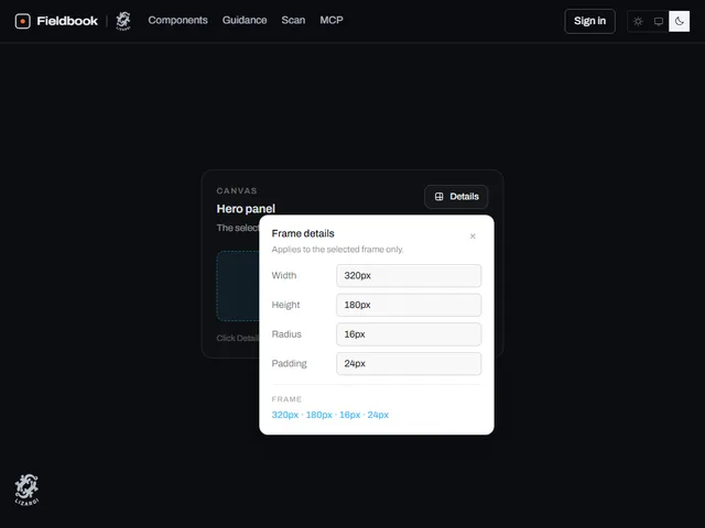
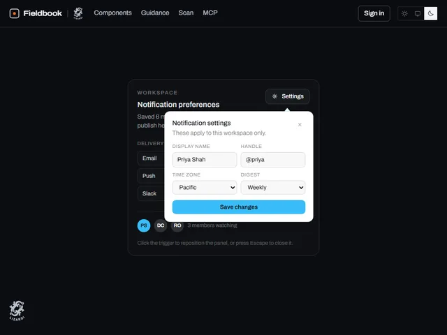
  • Anchored detail popover

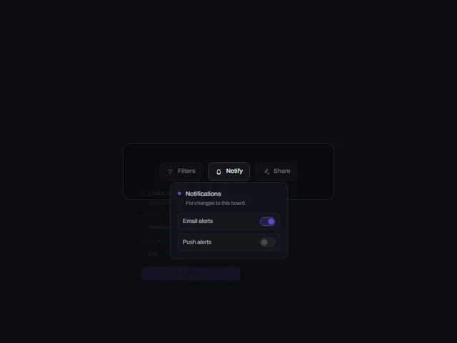
    Um botão de gatilho que abre um pequeno painel ancorado contendo um formulário de configurações intitulado, saindo da borda do gatilho e fechando em Escape ou em um clique externo.

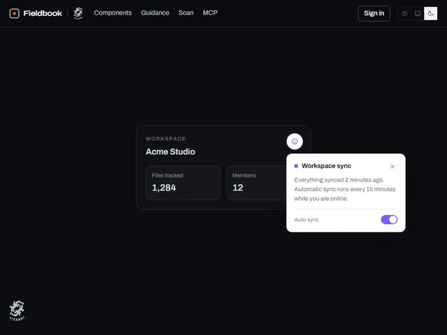
  • Anchored info popover

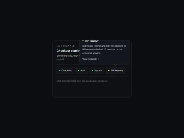
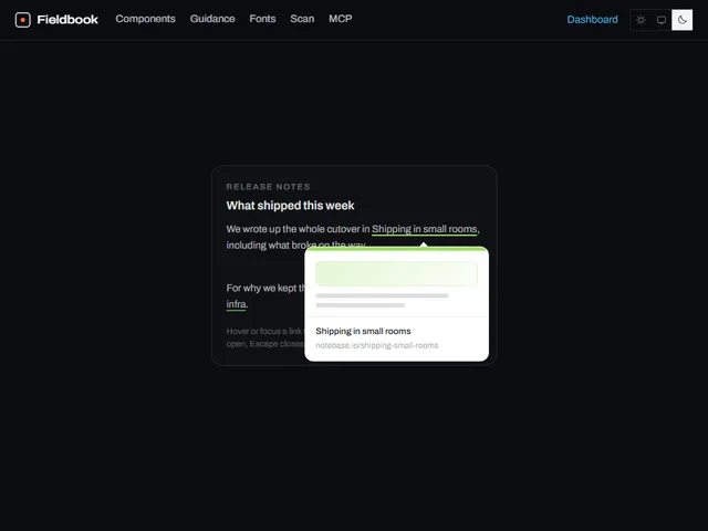
    Um botão de disparo que abre um pequeno painel de informações flutuante ancorado em uma de suas bordas, desaparecendo e aumentando a partir dessa borda e sendo descartado ao clicar externamente ou Escape.

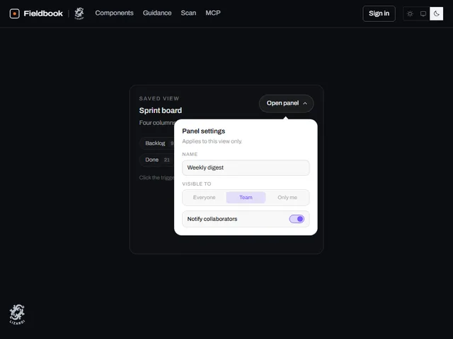
  • Anchored popover card

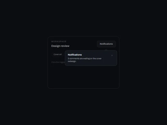
    Um botão de gatilho que abre um pequeno cartão de configurações ancorado em si mesmo, aumentando a partir da borda de onde cresce e fechando com um segundo clique, Escape ou um toque externo.

Orientações de design
Abrir o índice completo
Etiquetas
3d (16)accessible (4)accordion (9)action (3)actions (6)activity (5)add (7)admin (12)agent (12)alert (8)align (3)ambient (39)analytics (13)anchored (3)animated (82)animation (4)annotation (3)app shell (3)arc (4)arcs (3)area (12)area chart (4)arrow (32)audio (3)aurora (4)auth (11)authentication (12)auto height (4)autocomplete (4)avatar (10)avatars (3)axis (5)backdrop (18)backer (3)background (54)badge (21)band (6)banner (9)bar (16)bar chart (3)bars (6)beam (6)beams (5)bevel (12)bezel (3)billing (10)bin (3)blend (4)blob (4)blobs (3)bloom (10)blur (15)booking (9)bookmark (3)border (16)bounce (6)brackets (3)breadcrumb (4)breathing (3)broadcast (3)burst (7)busy (5)button (397)button group (5)buttons (4)calendar (32)call to action (11)callout (3)canvas (89)capsule (12)caption (8)card (35)cards (7)caret (5)carousel (11)cascade (3)category (3)cells (4)chain (3)characters (4)chart (59)chat (4)check (3)checkbox (13)checklist (7)checkmark (5)chevron (10)chip (22)chips (4)circle (9)circular (5)click (7)clip (9)clipboard (3)close (4)cloud (3)cluster (3)code (6)collapse (11)collapsible (6)collision (3)column (4)columns (3)combobox (4)command palette (3)commercial (10)compact (8)comparison (8)composer (4)concentric (4)confetti (4)confirm (24)confirmation (7)console (5)contact (3)context menu (4)controlled-state (18)copy (4)corner (6)corners (7)count (7)count-up (3)counter (18)crossfade (5)crosshair (6)cta (28)cue (4)cursor (26)curtain (7)curve (4)customer (13)cycle (6)dark (15)dark mode (4)dashboard (9)dashed (5)data (13)date picker (16)date range (13)deck (3)delay (5)delete (8)depth (32)destructive (9)destructive-action (4)device mockup (3)diagonal (13)diagram (3)dial (5)dialog (17)digits (5)direction (5)disc (5)disclosure (8)dismiss (6)displacement (3)distortion (5)divider (4)dock (4)donut (7)dots (15)download (10)drag (21)draw (3)drawer (10)drift (17)dropdown (18)dropdown menu (3)duration (3)easing (4)echo (3)edge (7)edge light (3)editor (3)elastic (8)elevation (6)ellipsis (3)email (3)emboss (4)emphasis (3)empty state (3)entrance (14)error state (3)events (3)exit (3)expand (23)explorer (3)fade (9)falling (3)falloff (4)fan (6)faq (4)feed (3)feedback (12)field (6)fill (46)film (3)filter (13)finance (10)flat (6)flat shadow (3)flight (3)flip (10)floating panel (4)flood (14)flow (5)fluid (3)flyout (3)focus (19)focus ring (5)focus trap (6)folder (5)follow (11)form (47)form-control (12)formatting (3)frame (19)gallery (15)game (3)gap (4)gauge (5)gesture (6)ghost (7)glare (3)glitch (9)glow (39)glyph (7)gradient (38)grain (10)gravity (3)grid (35)group (8)guide (3)hairline (8)halftone (4)halo (15)hamburger (4)hard shadow (6)heading (8)headline (19)hero (11)hexagon (3)highlight (22)hinge (4)hint (12)hold (6)horizon (3)horizontal (4)hover (251)hover card (10)hover reveal (3)icon (121)icon-button (23)icons (4)identity (3)indeterminate (4)indicator (9)inertia (4)initials (3)ink (4)inline (5)input (20)input group (3)inset (11)interactive (50)invert (26)italic (3)key (11)keyboard (20)keyboard navigation (6)keycap (10)knob (4)kpi (5)label (14)label reveal (3)label swap (9)labels (7)lag (4)lattice (4)launch (3)layered (9)layers (3)layout (18)ledge (6)legend (9)lens (4)letters (10)lift (19)light (22)lightbox (4)like (4)line (11)line chart (4)lines (8)link (11)link preview (7)liquid (7)list (13)live (3)loader (9)loading (27)log (3)login (10)loop (42)magnet (5)magnetic (3)magnify (3)map (4)marker (3)markers (6)marquee (8)mask (9)matrix (4)media (4)menu (23)merge (3)mesh (5)message (4)metal (10)meter (5)metric (10)metrics (5)minimal (10)modal (19)monospace (12)monthly (12)morph (14)motion (3)motion tuning (3)moulded (6)multi-select (4)nav (3)navbar (3)navigation (21)nested (7)neutral (4)night (4)noise (16)notification (3)notifications (4)nudge (4)number (11)odometer (5)offset (7)on-off (4)onboarding (3)one time code (5)options (5)orb (4)orbit (13)otp (3)outline (63)outlined (4)overflow (7)overlay (24)overshoot (3)page (18)palette (3)panel (31)panels (6)paper plane (4)paragraph (3)parallax (15)particles (18)paste (3)path (4)pattern (9)percentage (4)perimeter (3)perspective (20)photo (5)physics (5)picker (3)pie (7)pill (83)pill switch (4)pin (3)pinned (3)pixel (3)placeholder (4)plane (5)plate (9)play (4)playful (7)pointer (65)polar (8)pop (4)popover (17)post card (3)power (3)press (77)pressed (6)pricing (3)primitive (4)print (4)product (6)profile (8)progress (27)proportion (4)providers (4)pulse (17)queue (3)quiet (5)radar (9)radial (8)radio (4)radio group (8)raised (3)ramp (5)ranking (3)rays (4)readout (4)record (4)registration (3)relay (3)relief (6)remove (3)reorder (3)resize (4)restore (3)retro (4)retry (3)reveal (80)ribbon (6)rim (8)ring (25)rings (10)ripple (18)rise (3)roll (6)rotate (21)rotating text (4)rotation (6)round (5)rounded (3)row (11)rows (4)save (5)scale (20)scan (5)scatter (4)scheduler (3)scramble (5)screen (3)screenshot frame (3)scroll (38)scrub (5)search (8)section (4)sections (4)segmented (7)segmented control (12)select (5)selection (5)send (23)sequence (8)series (7)settings (21)shadow (28)shape (3)share (25)shared element (4)sheen (14)sheet (4)shell (3)shimmer (8)shine (5)shortcut (4)shuffle (3)shutter (5)sidebar (7)sign in (11)signal (8)signup (9)silhouette (3)sizes (4)skew (9)slab (6)slide (20)slider (10)sliding highlight (7)sliding indicator (3)snap (4)social (6)soft (6)space (5)spark (3)sparkline (3)spin (15)spinner (9)split (9)split-flap (3)split text (3)spotlight (7)spring (63)square (5)squash (4)stack (17)stacked (7)stagger (40)staircase (3)star (3)stars (6)stat (5)state (11)static (3)status (21)stepper (3)steps (3)sticker (4)sticky (4)streaks (3)strikethrough (3)stripes (5)stroke (6)submenu (9)submit (7)subtle (3)success (3)surface (5)svg (102)swap (12)sweep (40)swell (4)swipe (5)swirl (3)switch (16)tabs (22)tactile (26)tap (4)target (3)task (3)team (5)terminal (3)text (40)text button (3)text-effect (3)text field (4)text transition (3)textarea (4)texture (11)theme (3)theme toggle (4)thumbnail (4)ticker (5)tile (16)tiles (12)tilt (26)time (3)time range (3)time series (3)timeline (3)timer (3)timing (5)tint (5)toggle (65)toggle group (10)toolbar (25)tooltip (37)total (3)touch (3)trace (4)tracking (6)trail (20)transition (6)translucent (9)travel (6)tray (3)tree (3)trend (10)trigger (4)tunnel (4)twinkle (4)typewriter (9)typing (8)typography (18)underline (10)upload (5)uppercase (14)validation (5)value (3)values (4)variants (4)velocity (3)verification (8)video (4)viewport (6)voice (3)warp (6)wash (5)wave (13)waveform (3)waves (7)window (3)wipe (23)wireframe (3)wireless (3)wobble (6)word swap (3)words (3)workflow (18)workspace (36)wrapper (3)zoom (4)