按钮
Departing send button
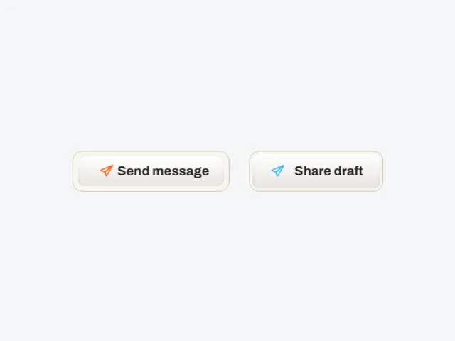
Departing send button:发送按钮悬停时图标从右侧飞出,原文字清空,扩散的强调色上方显现第二行文字。
使用 Departing send button
Departing send button 的预览采用「行内」布局,主题设置为「浅色/深色」。
自定义预览
这些控件会传给演示组件。默认值和限制描述的是预览;完整的属性接口请查看实现代码。
| 控件 | 类型 | 默认值 | 预览限制 |
|---|---|---|---|
accent | color | #38BDF8 | 元数据未列出其他限制。 |
label | text | Send message | 最多 24 个字符 |
hoverLabel | text | On its way | 最多 24 个字符 |
lift | number | 2 | 范围 0 至 6;步长 1 |
flightDistance | number | 200 | 范围 100 至 400;步长 10 |
Departing send button 提供哪些框架版本?
Departing send button 提供 React、Vue、Svelte、Astro、HTML 版本。实时预览使用 React;以下代码观察仅针对 index.tsx。使用其他版本前,请确认其交互行为。
Departing send button 有哪些依赖?
React 元数据列出的额外 npm 依赖为:motion。
Departing send button 的代码中有哪些无障碍细节?
Departing send button 的 React 代码包含:原生元素(button);属性与事件处理器(aria-hidden、aria-label)。这些信息来自代码观察。请在组合后的页面中验证无障碍名称、焦点顺序和键盘行为。
Departing send button 如何处理减少动态效果的偏好?
Departing send button 的 React 代码通过 useReducedMotion() 读取动态效果偏好。index.tsx 中随偏好变化的表达式:opacity: departed && !reduce ? 0 : 1;reduce ? "" : ` 60ms`;reduce ? "linear" : EASE。请启用减少动态效果,检查完整实现、共享样式和所选框架版本;这些观察不能证明所有动画都会停止。