Buttons
Rim to fill gradient button
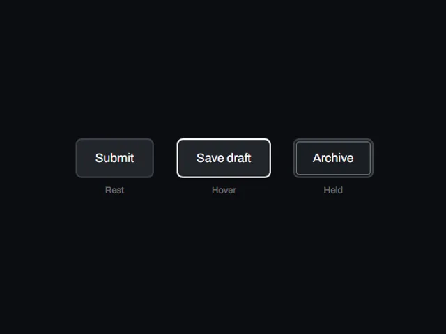
A dark button shows only a thin gradient rim at rest; hovering drops the inner panel so the gradient floods the whole face, and pressing squeezes it down.
Using Rim to fill gradient button
A dark button shows only a thin gradient rim at rest; hovering drops the inner panel so the gradient floods the whole face, and pressing squeezes it down.
Try the live preview with a pointer and keyboard, then check focus visibility and the narrow layout in your own page. Use the plate number or slug when asking your coding agent to fetch this component.
Props: label, accent, endColor, rimWidth, angle, pressScale
Which frameworks are available?
The catalog lists these versions: react, vue, svelte, astro, html. The live preview on this page runs React.
How do I access the implementation?
The code, framework versions and installation commands are available in the workbench above.