Buttons
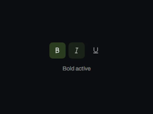
Pressed highlight toggle
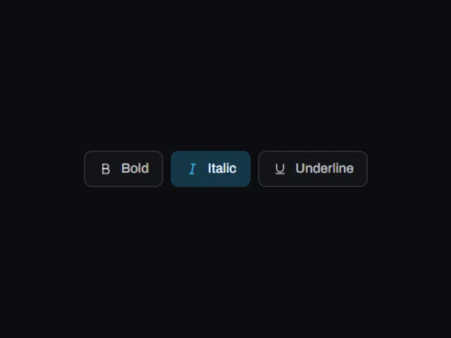
A two state icon button that keeps its pressed state visible with a rounded highlight block growing behind the glyph from the centre out.
Using Pressed highlight toggle
A two state icon button that keeps its pressed state visible with a rounded highlight block growing behind the glyph from the centre out.
Try the live preview with a pointer and keyboard, then check focus visibility and the narrow layout in your own page. Use the plate number or slug when asking your coding agent to fetch this component.
Props: accentColor, size, skin, pressed, disabled
Which frameworks are available?
The catalog lists these versions: react, vue, svelte, astro, html. The live preview on this page runs React.
How do I access the implementation?
The preview and component description are public. Sign in with an authorized account to open the code, framework versions and installation panel.