Inputs
Compact Time Range Picker
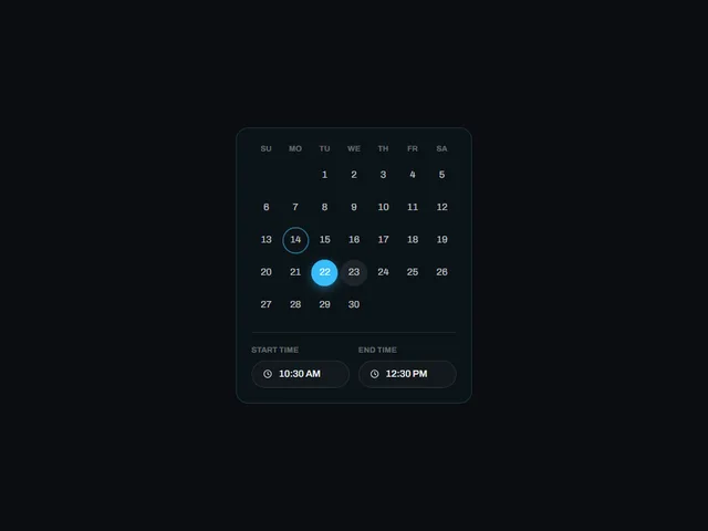
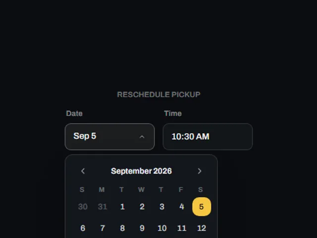
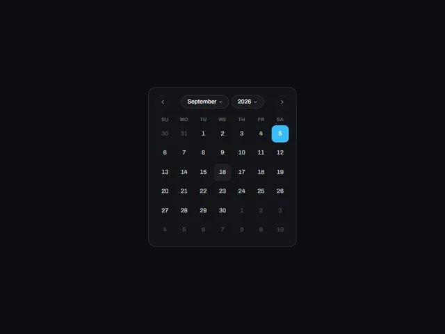
A month calendar card with a two-cell time range strip in the footer, the two time fields divided only by a short dash so the pair reads as one range control.
Using Compact Time Range Picker
A month calendar card with a two-cell time range strip in the footer, the two time fields divided only by a short dash so the pair reads as one range control.
Try the live preview with a pointer and keyboard, then check focus visibility and the narrow layout in your own page. Use the plate number or slug when asking your coding agent to fetch this component.
Props: accent, startTime, endTime, cellSize
Which frameworks are available?
The catalog lists these versions: react, vue, svelte, astro, html. The live preview on this page runs React.
How do I access the implementation?
The preview and component description are public. Sign in with an authorized account to open the code, framework versions and installation panel.